Chaw Ai Chia
Projects
01 Social Media Posting

International Mens Day
Sealy
Overview
This project was created to show that successful men are active and hardworking. The main visual shows a man hiking to represent strength and determination. After doing challenging activities like hiking, rest becomes important, and this is where the Sealy mattress is needed to provide comfort and recovery.

Everything is Better After A Good Night’s Sleep
Sealy
Overview
The concept shows a person sleeping on a mattress with a very comfortable and refreshed facial expression to highlight the feeling of quality rest. Warm tones are used in the surrounding environment to represent the calm and peaceful mood of early morning after waking up. This project was created as an animated visual based on Sealy’s requirements.

Sealy
Global Sleep Census
Overview
This project consists of several reels created for the Global Sleep Census campaign. Although the designs may look similar, each reel contains different content while using the same template to maintain visual consistency. I was also required by Sealy to animate the visuals.
Where Magical Dreams Begin
Sealy
Overview
This project was created for the Christmas season. In Malaysia, people usually clean and organize their rooms during festive celebrations, so I developed a visual concept that shows the transformation from an empty bed frame to a fully prepared bed with a mattress, pillows, and fitted sheets. The step-by-step setup represents the process of refreshing or changing to a new mattress during Christmas. This project was also animated based on Sealy’s request to make the visual more engaging and suitable for social media content.


Sealy
Christmas Countdown Sale
Overview
This project was created for the Christmas season with the concept of promoting the Sealy bed as a meaningful gift for loved ones during the celebration. The idea highlights that a mattress can be more than just a product, but a thoughtful and practical Christmas present. Therefore, the visual includes ribbon elements and a box-like presentation to resemble a gift, reinforcing the festive theme.
iCari Poster
AIA
Overview
This project is titled “Financial Achieving FIRE with 5 Strategies.” I developed two design options, and AIA selected the purple version. The content focuses on financial planning and strategies on how to save money to achieve financial independence and have sufficient funds for retirement. Therefore, the visuals include money-related graphics and illustrations of elderly individuals to represent retirement life. The concept shows that when they have enough savings, they can enjoy their later years by traveling and living comfortably, which is reflected in the travel-themed illustrations within the poster.


Festive Social Media Campaign
LFR
Overview
This project is a Festive Social Media Campaign for LFR, covering celebrations such as Christmas, New Year Countdown, Deepavali, and Winter Solstice. I mainly used 2D illustrations and bright colours in the design because the company aims to target a younger audience.
Chinese New Year Campaign
Manulife
Overview
I was responsible for arranging the visual designs, while the illustrations were not created by me.


Eid al-Fitr Campaign
Manulife
Overview
I was responsible for arranging the visual designs, while the illustrations were not created by me.
Festive Campaign Reels
Manulife
Overview
The visual design was not created by me, my responsibility for this project was focused on the animation part only.

02 Playcard Design

ELC & Pacesetter Playcard
AIA
Overview
This project includes two types of playcard illustrations. The illustrations were not designed by me, as they were existing visuals created earlier by my colleagues and later adapted into the playcard format. My role was mainly to handle the arrangement and layout. The playcards were produced collaboratively with several team members.
03 Packaging Design
Mini Skincare Set
kyth+kyn
Overview
I was only responsible for the arrangement and adapting the existing visuals into the packaging. My role included placing the information and organizing the layout accordingly. This project was produced together with other team members.

Merchandise
CTC
Overview
CTC is a graphic design service company established by three founders, including myself, based on the assignment requirements. The concept of this project is traditional, combining cultural elements from different ethnic groups in Malaysia, as the target audience of CTC is the whole of Malaysia. The CTC logo was not designed by me, as it was created in a previous group assignment. In the following semester, we were required to take our earlier group project and adapt it into a new individual assignment. Therefore, all elements were developed by me except for the logo.

04 Motion Graphics
Festive Campaign Gif
Manulife
Overview
The visual design was not created by me. My role was to handle the animation, transforming it into a gif format. This animated gif was designed to be used as an email greeting. There were two versions of the GIF: one without the CEO’s photo and another including the CEO’s photo. I created these for both the Chinese New Year and Aidilfitri celebrations.

05 Certificate Design

Graduation Certificate
Prudential
Overview
Edited and organized recipient photos within a provided certificate template, including updating names and graduation dates for each certificate.
06 Voucher Design
Sealy x Avaland Aetas Damansara Exclusive Voucher
Sealy
Overview
A minimalist voucher design featuring circular elements to create a clean and balanced composition. The design approach focuses on simplicity to align with the company’s preferred visual style.

07 Advertising Design

Overview
This poster and video were created as part of a group assignment in which we selected a brand and developed promotional materials as if it were our own company. We chose Coca-Cola and focused on highlighting the evolution of its bottle design from its establishment to the present. Red was used as the dominant color to reflect Coca-Cola’s strong brand identity. Traced bottle illustrations and water elements were incorporated to emphasize the brand’s history, freshness, and coolness.
Advertisement for Coca Cola
Coca Cola
Service Advertisement for Daikin
Daikin
Overview
This poster series was created as part of an assignment for Daikin, focusing on VRV maintenance services. The posters highlight health issues caused by poor air conditioner maintenance, such as germs that may lead to colds, red eyes, and skin irritation. Proper VRV servicing helps create a cleaner, fresher, and more comfortable living environment.


Advertisement Series for Cameron Valley
Cameron Valley
Overview
This poster series explores festive celebrations through Chinese New Year, Deepavali, and Eid Mubarak. Specific colours and cultural symbols were applied to represent and distinguish the identity of each celebration. The video component was developed as a group assignment, where I was responsible for video editing and also participated as a cast member.
08 Bill Book Design
songkok melayu & ZN Properties Development
Overview
Made bill books for two companies with reference materials, selecting text that matched, and following researched layout arrangements.

09 Banner & Bunting

Dialysis Centre Information Banner
Overview
This banner design was created for a Dialysis Centre, with colours selected based on the client’s preference. Relevant images were included to support the text content, highlighting individuals who are eligible for treatment as well as the medical equipment and facilities provided.
SEK. KEB. TIONG K. BHARU
Overview
This banner was created during the SIEP program, where I was involved in the overall design process. The layout arrangement was assisted by my colleague, while I independently developed the visual design elements. The colour scheme, using yellow and green, was chosen by the client, and I followed their requirements to ensure the design aligns with their requested direction and branding preferences.

10 Video Editing

Vlog: How to Plant a Cactus
Overview
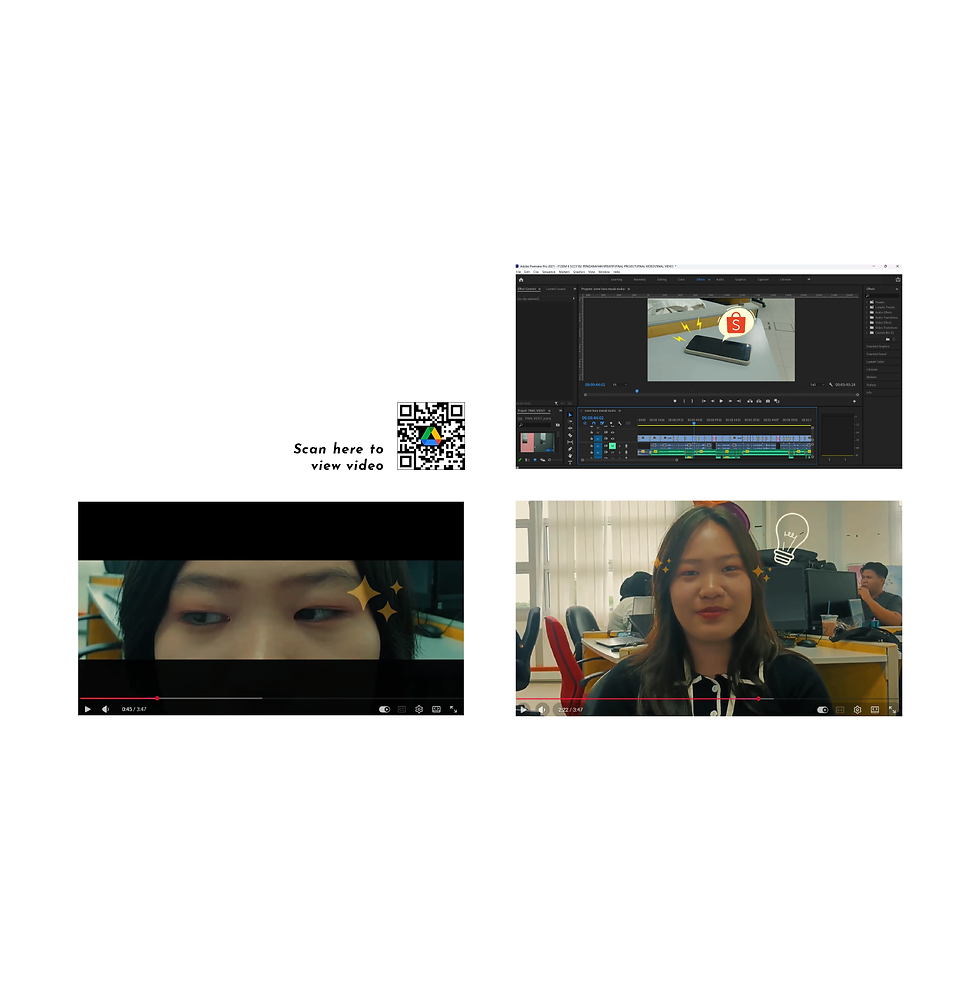
This project was completed as an individual assignment where no specific topic was given by the lecturer, allowing creative freedom in content selection. I chose to produce a vlog titled “How to Plant Cactus,” focusing on a simple and engaging visual presentation. The video was edited using Adobe Premiere Pro, where most of the effects were created manually, with some transitions applied using built-in tools within the software.
Tersirat di Dalam Bayangan (Horror Short Film)
Overview
This group assignment involved the production of a short horror film titled Tersirat di Dalam Bayangan, developed over a 14-week process from pre-production to post-production. As the director, I worked closely with my team under On Set Production to plan the storyline, develop the script, and execute the filming process. I also took on the role of the ghost character in the film, contributing to the visual performance. The project focused on creating a suspenseful horror experience through the use of cinematography, lighting, sound design, and editing, with the final outcome presenting a cohesive and engaging narrative.

Video Pantomim
Overview
This is a group project that involves producing a video based on the chosen theme, “procrastination.” The project was developed through idea discussions, storyboard creation, scriptwriting, and filming. The final video is presented without dialogue, with a focus on visual storytelling elements. In this project, my role was acting in the video, editing all recorded footage, and assisting with minor parts of the report.
11 Product Photography
The Glossy Peach Lipstick
Overview
This assignment explores product photography through a combination of composition, lighting, and art direction. Various angles were used to enhance product details, while different lighting setups. Decorative elements and textured backgrounds were incorporated to create a cohesive promotional visual that aligns with the product’s identity.

12 Magazine Design

Bring Our Turtle Back
Overview
This magazine design project explores environmental awareness through a magazine titled “Bring Our Turtle Back.” The layout combines typography and illustrative elements to communicate the importance of marine conservation. Green and blue tones were used consistently to represent nature and the ocean, reinforcing the theme and creating a cohesive visual identity throughout the publication.
13 Branding Design
CAC Personal Branding Design
Overview
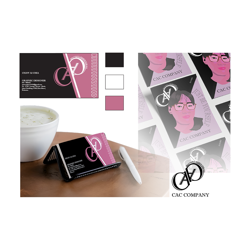
This project focuses on developing a personal brand identity as a graphic designer under the name CAC, derived from the initials of my name. The visual identity includes a logo, business card, and promotional poster. Black, white, and purple were used consistently throughout the designs, reflecting my personal preference.

CTC Company
Overview
This project develops a brand identity for a graphic service company as part of a group assignment. The name CTC comes from the initials of three members. The logo uses magenta, yellow, and blue, inspired by printing colours, while square elements represent honesty, stability, and solidity.
Personal NFC Card Design
Overview
This is a personal NFC card design created as part of my portfolio assignment, which I later used to apply for my internship. The NFC card was a required component of the project. As it was developed alongside my portfolio, I applied a consistent blue color scheme to match the overall visual identity. I also incorporated a traced illustration of my own face as the logo, aligning it with the cover page design of my portfolio for a cohesive and personalized branding approach.

14 Signage Design

Road Safety Signage Design
Overview
This assignment presents a set of road signage designs aimed at improving safety and awareness among drivers. The first warning sign alerts drivers to exercise caution in playground areas, particularly where children may unexpectedly run into the road, while the second prohibition sign discourages vendors from selling goods to drivers on the roadside. Both designs utilise clear black illustrations and supporting sign elements to effectively communicate their messages in a direct and visually accessible manner.
15 Apparel Design
DTF Printing & Apparel Application
Overview
This assignment focuses on the development of apparel-based design for the brand ExclusiVibe Wear, incorporating both traditional and heat transfer DTF printing techniques. The designs were applied across various products including t-shirts, tote bags, and caps, along with supporting elements such as price tags and catalog layouts to simulate a real commercial branding system.

16 UX/UI Design

Hopper App Redesign
Overview
This project focuses on improving the user experience of the Hopper travel application through a redesign approach. The team identified several issues in the original app, including the lack of restaurant search and reservation features, a non-user-friendly layout, and confusing functions such as car booking. Additionally, concerns were raised regarding the absence of service guarantees and user trust. As a solution, the redesigned app introduces enhanced features such as restaurant search and reservations, integrated e-hailing and car rental services, improved guarantee systems, and more flexible payment options including e-wallet and credit card, aiming to create a more efficient and user-friendly travel experience.
17 Animation Design
Kejutan Satay 2D Animation
Overview
This is a group assignment where we were required to create a fictional company named Animasi Kreatif Studio to simulate a real industry production workflow. The project, titled “Kejutan Satay,” is a moral-based animated story supported by a complete storyboard. My role was to compile all group illustrations, organize and edit the scenes using Adobe Animate, and assist slightly in the report preparation. I also designed my own character named Erin, incorporating personal elements, and all illustrations were traced before being animated in Adobe Animate.


3D Fanta Advertising Poster
Overview
This group assignment showcases a 3D animated Fanta advertising poster created using a low-polygon style in a vibrant tropical island setting. My role included assisting with a small part of the report, creating several 3D elements, and compiling my teammates’ assets to assemble and animate the final scene in Blender. The design features elements such as the sea, island, surfboard, beach umbrella, and a highlighted Fanta can, with added motion like clouds and waves to enhance realism. Overall, the poster effectively conveys a fresh, energetic, and youthful brand image.
18 Sticker Design
Sticker Design Collection
Overview
A series of sticker designs produced during my SIEP program for multiple companies and event, tailored to different branding and promotional needs.

19 FYP Project

Apollo Layer Cake Packaging Rebranding (Maximalist Approach)
Overview
This project focuses on rebranding Apollo layer cake packaging using a maximalist design approach, as the brand has maintained a consistent packaging style over time. The vibrant 3D and cheerful visual direction was developed based on respondent preferences. The packaging illustrations are concept-driven, inspired by picnic settings commonly associated with enjoying Apollo, featuring playful elements such as children flying kites, bubbles, and bicycles. Colours and character elements are customised according to each flavour to enhance product differentiation. The main characters were modelled in Blender, while additional graphic elements were refined in Photoshop and Illustrator to ensure a consistent 3D visual style across the overall design.